User Research | UX | UI | Prototyping
About the Project
Paws Welfare Shelter is an animal shelter app that allows users to conveniently and practically contribute to the shelter and its animals.
Either by scheduling the days they can go to help, sponsoring an animal, or donating goods, among other ways.
Why an Animal Shelter?
Two of the biggest challenges for animal shelters are the shortage of human and financial resources and raising and retaining volunteers.
For volunteers, it's not having all the contribution options centralized and the chance to do them in an easy and accessible way.
This app aims to provide an effortless and satisfying way to contribute in any way possible to the shelter and consequently raise and retain more volunteers.
My Approach

Empathize
Industry Research
For this project, I decided to do primary and secondary research to better understand the challenges and needs of this subject, focusing on a few initial questions.
➜ Who is the main user?
➜ What kind of goals do they have?
➜ What are their main struggles?
➜ Why would anyone want to use this app?
➜ How can this app best meet their needs?
I conducted a competitive audit to evaluate some direct and indirect competitors, and some of the parameters assessed were: unique value proposition, first impressions of the experience, features, accessibility, user flows, navigation interactions, visual and brand identity, and content and tone.
I looked at several potential competing apps, and while none of them directly compete with this app, they still have elements related to this domain.
The Paws Welfare Shelter app has the opportunity to bring the most suitable features from each of the other apps and websites to create a one-stop app without overwhelming the user's selection.
Competition characteristics
THE GOOD
✔ Provide sign up for volunteer activities
✔ Show the log of volunteered hours
✔ Option to receive notifications about shifts
THE BAD
✗ Shortage of different types of volunteering available
✗ Outdated design, not visually appealing
✗ Unclear information hierarchy, difficult to scan quickly
✗ Lack of accessibility
Following secondary research and a survey to shed light on some assumptions, it became apparent that the focus fell into two main categories: having an easy way to schedule a volunteer visit to the shelter and finding alternative ways to help.
Definition
Meet the Users
This app has been designed with animal lovers in mind.
It's aimed at people who already do volunteering or plan to do so in the future.
It could be for someone looking to adopt a pet for the first time or someone who wants to help an animal without going to the shelter.
These personas help identify the requirements the project needs to meet.

Pain Points
As a result of the research and evaluation of competitors' products, these were the key challenges outlined:
• Limited communication - Due to a lack of staff and resources in the shelters, there isn't always someone available when needed to handle calls and e-mails to provide information to those who want to know more.
• Availability - Users don't always have the time to go to the shelter in person, and consequently don't have much of a connection with the animals and end up not being involved.
• Accessibility - Users don't have all the support opportunities available in one place nor the possibility to do so practically and reliably.
Designing a Solution
Taking into account the insights made so far, the pain points, and the existing gaps in the current applications, here are some of the high-level goals and opportunities for this app:
• Provide potential volunteers with multiple ways to contribute to the shelter and its animals
Offer a wide range of options, keeping in mind that not all positions need to be animal-related. Include important possibilities such as adopting (show animals that are suitable for adoption), sponsorships, and donations.
• Design a fully functional and up-to-date app that allows users to schedule a visit to the shelter
Create a straightforward flow through an online scheduling system. Doing this helps smooth the process for both the shelter and the users.
• Create a strong visual identity and appealing minimalist interface
Provide only the information needed at the moment and make it easy to scan. People can only look at so much information on a screen without losing interest. Engage with a friendly, informal, and informative tone of voice.
Volunteers need to feel a sense of fulfillment and know they are appreciated. It's easier to retain volunteers when they feel needed and make a difference. Acknowledge to them the impact their contribution has on the organization.
❛ Focusing on user satisfaction will ultimately get results when seeking to retain volunteers. ❜
Ideation
I began by organizing the app's backbone to figure out how I could allocate the information to make it more intuitive. Then I built a user flow of what a journey looks like from start to finish while scheduling a visit to the shelter, which helped me understand how users might interact with the app.

Wireframes
Having defined the primary purposes and architecture of the app, I started sketching different ideas to find the best solutions. From there, I proceeded to wireframes where I merged the best elements and then to the low-fidelity prototypes, which were useful to understand where there might be flaws in the user flows.

What Works?
After finishing the first round of low-fidelity prototypes, I conducted a usability study where I received valuable feedback from the participants.
I invited them to perform three tasks, which allowed me to assess the app’s navigation intuitiveness. They had to reach the volunteer screen, complete all the stages, and confirm the visit.
Overall, all participants were able to finish the tasks presented.
The hurdles I uncovered during the assignments were:
• Very constrained choices
Some participants felt that the options were too linked, and ended up selecting something they didn't want.
• Unsure about selecting time
The way the time selection was initially displayed caused some confusion, as participants were not sure if the time slot would be available for the shelter.
• Unclear when to add the shift at the end
The copy led to a misunderstanding as it implied that the shift would be scheduled at that moment when in reality, the user would still confirm the details first.
I then went back to redesign some wireframes and test the new interactions.
This step proved to be significant for gaining more insights about the user and optimization of the app.

Prototypes
Mockups & Prototypes
From the beginning, the focus was on creating a friendly and intimate language, forming a connection with the user through the animal's pictures, and showing how long they have been in the shelter.
It was also about finding a balance between presenting it as a reliable app, building trust to engage and use the processes offered, such as donations, and designing a lightness alongside.
The aim was also to convey a sense of positive energy to ensure that using the app is enjoyable, hence the pastel color scheme, the informal font with good legibility, and white space to give the information room to breathe.

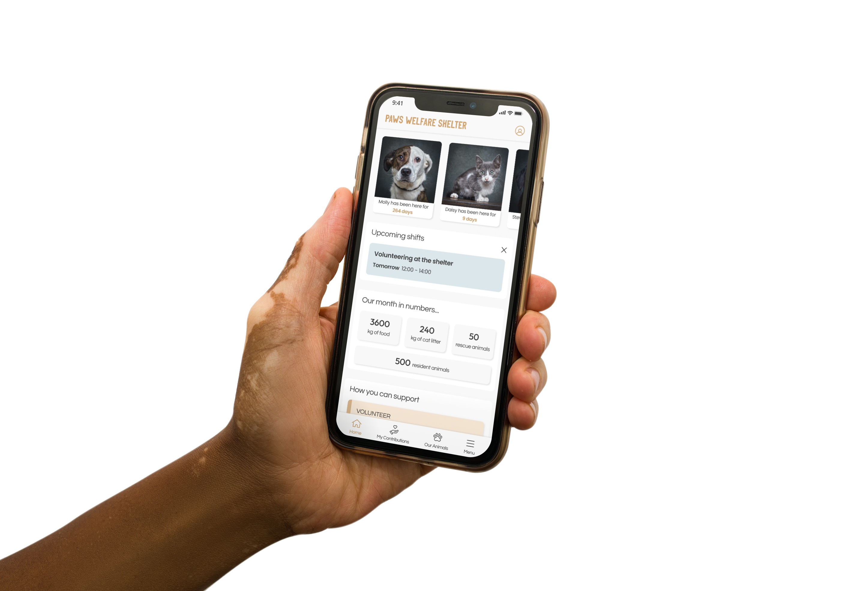
FIRST SCREEN
✤ Creating an emotional bond
This screen displays photos of some of the animals at the shelter and how long they have been there.
It also shows relevant numbers for users to get an idea of the shelter's monthly needs and the opportunities to contribute.
SCHEDULING SCREEN
✤ Easy process and simple user flow
Manual processes were replaced by online scheduling.
With a volunteer management system, volunteers can schedule a visit for a specific shift by the availability provided in the app and have the option to choose its regularity.


OUR ANIMALS SCREEN
✤ Knowing more about the animals and their life stories
It's crucial to show users who they can help, especially when it comes to volunteering options that don't require direct contact with the animals.
So we provide a way to create a connection by getting to know more about the animals and what they lived through until they arrived at the shelter.
NOTIFICATIONS SCREEN
✤ Meaningful recognition messages
Activity reminders and messages of appreciation to volunteers for their time and dedication were also included. Heartfelt acknowledgment can go a long way in letting people know that they are valuable contributors.

Clickable Prototype

Style Guide

Conclusion
Takeaways
This project was challenging because not only did I aim to create an app that would serve users in the best way possible, but it also had the side effect of making them frequent contributors to the shelter. I tried to achieve this by applying a holistic psychological approach through copy, photos, and features.
It taught me the value of the usability tests that were essential in improving certain elements and flows of the app and thinking critically, as this was the first project I designed from scratch.
Going further, I'd like to develop more user flows, like the process of adoptions or donations or designing the screens for the shelter's point of view. Also, to do another usability test for the high-fidelity prototypes and some A/B testing to validate the voice and tone.
Thank you for reading!


